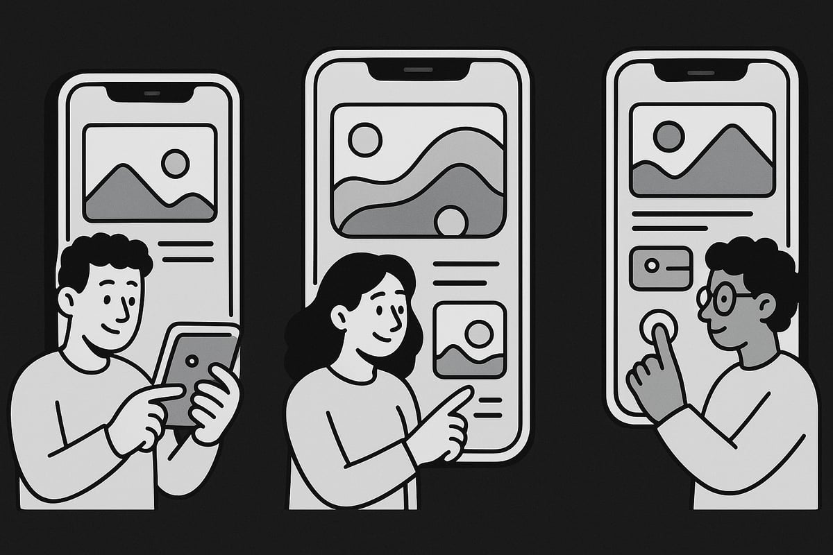
7 Inspiring Ways to Design Mobile Website for 2025
The landscape of mobile website design is transforming rapidly as we approach 2025. With mobile usage now shaping how people access the web, businesses must adapt or risk falling behind.
To truly stand out, brands need to design mobile website experiences that are not only visually impressive but also intuitive, fast, and inclusive. Staying ahead means embracing the latest trends in UX/UI, performance, accessibility, and interactivity.
This article reveals seven inspiring ways to design mobile website solutions that capture attention and deliver real results. You will discover actionable strategies covering visual storytelling, future-proofing, and more, all aimed at helping you build a modern, user-centric mobile presence.
Ready to elevate your approach? Explore these strategies and position your brand at the forefront of mobile website innovation for 2025.
The Importance of Mobile-First Design in 2025
The digital landscape in 2025 is shaped by a dramatic shift in user behaviour. Today, designing a mobile website is not just an option, but a necessity for any business looking to thrive online. Mobile devices are now the primary gateway to the web, and brands that prioritise mobile-first strategies are leading the way.

The Mobile-First Revolution
Recent years have seen mobile traffic surpass desktop, with over 60% of global web visits now coming from smartphones and tablets. According to Mobile web traffic statistics 2025, this trend is only accelerating. When you design mobile website experiences that adapt seamlessly, you meet users where they are and position your brand for success.
This ongoing revolution means that responsive, mobile-optimised design is the foundation of every successful digital project. No matter the industry, the expectation is clear: users want fast, intuitive, and visually compelling experiences on every device.
SEO, Core Web Vitals, and User Expectations
Google’s mobile-first indexing makes the mobile version of your website the primary source for ranking and visibility. Core Web Vitals, such as loading speed, interactivity, and visual stability, are now essential benchmarks. If you design mobile website layouts with these factors in mind, you enhance both SEO and user engagement.
User expectations have evolved. People demand instant access, seamless navigation, and features that work perfectly on smaller screens. They are quick to abandon sites that fail to deliver, making performance and usability critical to retaining visitors.
Competitive Advantage and Risks
Investing in advanced mobile design gives businesses a measurable edge. Brands like Airbnb and Shopify have achieved remarkable growth by prioritising mobile-first strategies. When you design mobile website solutions that are innovative and user-centric, you boost conversions, build loyalty, and outperform competitors.
Neglecting mobile optimisation comes with significant risks. Sites that are slow, clunky, or hard to use on a phone suffer from higher bounce rates and lower conversion rates. These missed opportunities can impact both revenue and reputation, especially as mobile continues to dominate.
Mobile as the New Default
Mobile is now the default for web design. Every project must start by considering the mobile experience before scaling up to larger screens. The most forward-thinking brands treat mobile as the core focus, not an afterthought.
The challenges of performance, accessibility, and interactivity are real, but they also present opportunities. In the next section, we unveil seven inspiring ways to design mobile website experiences that stand out and deliver measurable results in 2025.
Key Principles of Modern Mobile Website Design
Designing a mobile website for 2025 means embracing principles that put users first, ensuring every interaction is smooth and enjoyable. The best results come from a blend of simplicity, clarity, speed, and adaptability. Each of these pillars lays the groundwork for building trust, encouraging engagement, and keeping users coming back.

Simplicity is essential when you design mobile website experiences. Too much clutter or information overload can quickly frustrate users. Instead, focus on clear layouts, concise copy, and intuitive navigation. Speed is equally critical—users expect pages to load instantly, and slow sites often lead to higher bounce rates. For more foundational guidance, visit Website design and development insights for a deeper dive into effective strategies.
Responsive layouts are no longer optional. A well-designed mobile website adapts seamlessly to various devices, orientations, and screen sizes. Using flexible grids and scalable elements ensures a consistent experience whether on a smartphone, tablet, or foldable device. Visual hierarchy guides the eye, making content easy to scan and calls to action easy to find. Navigation should be effortless, with menus that are accessible and never hidden behind confusing icons.
Accessibility is a cornerstone for any modern attempt to design mobile website experiences. Meeting the latest WCAG 2.2 standards means your site works for everyone, including users with disabilities. This includes providing sufficient contrast, enabling text resizing, supporting screen readers, and ensuring every element can be reached via keyboard or assistive technology. Inclusive design practices not only broaden your audience but also improve SEO and comply with evolving regulations.
Touch-friendly interfaces and engaging micro-interactions make a significant difference. When you design mobile website features, ensure buttons and controls are large enough for thumbs, gestures are intuitive, and feedback is immediate. Micro-animations and subtle transitions guide users, highlight changes, and bring delight without slowing performance. Leading platforms like Figma and Dribbble showcase how these elements, when combined, drive higher satisfaction and better site performance.
7 Inspiring Ways to Design Mobile Website for 2025
The landscape of digital experiences is evolving fast. If you want to design mobile website projects that truly stand out in 2025, you need to look beyond the basics. Today’s users expect more than just responsive layouts—they demand seamless, interactive, and visually captivating journeys.
Staying ahead means embracing the latest trends, from fluid grids to AI-driven personalisation. As highlighted in Web design trends 2025, leading brands are already adopting gesture-based navigation and bold visual storytelling. If your goal is to design mobile website experiences that captivate and convert, these seven strategies will give you a competitive edge.
Below, you’ll discover actionable techniques, real-world examples, and practical advice for every stage of the mobile design process. Let’s explore how to design mobile website solutions that are both future-proof and user-centric.
1. Embrace Fluid and Responsive Layouts
The way you design mobile website layouts is changing rapidly. Static breakpoints are no longer enough. In 2025, fluid grids and adaptive components are essential for delivering a seamless experience, regardless of device. CSS Grid, Flexbox, and container queries empower you to create layouts that stretch and shrink in real time, even on foldables and emerging device types.
Brands like Airbnb and Shopify have set benchmarks by using advanced responsive techniques. Their mobile sites fluidly adapt, ensuring consistency and usability. If you design mobile website projects for a wide audience, this approach reduces bounce rates and boosts retention.
Actionable tips for fluid layouts:
- Use
minmaxin CSS Grid for scalable columns - Leverage container queries to adjust components contextually
- Test with tools like BrowserStack and Chrome DevTools
Statistics show that non-responsive sites can see bounce rates over 70 percent. To design mobile website experiences that stand out, focus on device-agnostic layouts and continuous testing.
2. Prioritise Ultra-Fast Load Times and Performance
Speed is a non-negotiable factor when you design mobile website experiences. Google reports that 53 percent of users abandon a site if it takes longer than three seconds to load. Optimising images with WebP or AVIF, lazy loading, and minimising third-party scripts are critical steps.
Implement a mobile-first performance budget. This means setting size limits for images, scripts, and fonts before you even start to design mobile website assets. Progressive web app features, such as offline access and instant loading, further enhance user satisfaction.
Actionable steps:
- Audit site speed with Lighthouse and PageSpeed Insights
- Split code and defer non-critical resources
- Compress images and serve next-gen formats
High-performing mobile sites consistently see higher conversion rates. Google’s Core Web Vitals offer clear benchmarks to guide your optimisation efforts. Make performance a core pillar as you design mobile website projects for the future.
3. Design for Thumb-Friendly Navigation and Minimal UI
User comfort is paramount when you design mobile website interfaces. Most interactions happen with thumbs, so understanding ergonomic zones is crucial. Bottom navigation bars, floating action buttons, and gesture controls are now standard in top apps and sites.
Fitts’ Law teaches us that larger, well-placed targets are faster and easier to tap. Simplified menus and minimal UIs reduce cognitive load and make navigation effortless. When you design mobile website structures, focus on essential CTAs and remove distractions.
Tips for thumb-friendly design:
- Place key actions within easy reach at the bottom of the screen
- Limit menu options to what’s necessary
- Use clear, touch-friendly buttons with ample spacing
Studies reveal that simplified navigation can improve engagement by up to 40 percent. Accessibility should also be a priority, ensuring everyone can easily use your site. Ergonomic, minimal interfaces are a must as you design mobile website journeys for 2025.
4. Integrate Micro-Interactions and Delightful Animations
Adding subtle animations and micro-interactions can transform the way users experience your site. When you design mobile website features, purposeful feedback—like loading indicators, button states, and transitions—creates a sense of polish and responsiveness.
Best practices dictate that animations should be fast, purposeful, and never distract from core content. Sites recognised by the Webby Awards and Awwwards excel by using micro-interactions to guide users and reward actions, boosting satisfaction.
To implement micro-interactions:
- Use CSS transitions for hover and tap feedback
- Animate loading states and progress bars
- Keep motion accessible—support reduced motion preferences
Performance remains key. Avoid overloading your site with heavy animations that slow it down. Research shows that interactive elements can increase retention and satisfaction by 20 percent or more. When you design mobile website experiences, micro-interactions provide a memorable finishing touch.
5. Leverage Visual Storytelling and Immersive Imagery
Bold visuals and immersive media are redefining how we design mobile website experiences. Full-screen images, video backgrounds, and tasteful parallax effects help tell a compelling story and forge emotional connections.
Creative industries and luxury brands often use carousels and interactive galleries to showcase products. Typography and colour choices further amplify storytelling, while optimised media ensures fast loading and accessibility.
Best practices for visual storytelling:
- Optimise images for mobile and use descriptive alt text
- Limit parallax and video effects to avoid performance issues
- Use high-contrast colours and readable fonts
Data shows that engaging visuals can increase time-on-site and conversions by up to 50 percent. Balancing aesthetics with usability is essential when you design mobile website visuals that resonate and convert.
6. Optimise for Accessibility and Inclusive Design
Accessibility is both a business imperative and an ethical responsibility. When you design mobile website projects, meeting WCAG 2.2 standards should be non-negotiable. This includes proper contrast ratios, support for text resizing, screen reader compatibility, and clear alt text.
Inclusive design patterns—like adaptable layouts, clear labels, and keyboard navigation—ensure everyone can access your content. Leading brands are setting the standard by making their mobile sites usable for people of all abilities.
Actionable steps for accessibility:
- Use automated tools like Axe or Lighthouse for audits
- Test with real users, including those using assistive technology
- Provide keyboard and voice navigation options
With over one billion people globally living with a disability, accessibility opens your brand to a wider market. Accessible sites also see SEO benefits as search engines prioritise usable, well-structured content. Make inclusivity central as you design mobile website experiences.
7. Future-Proof with AI, Personalisation, and Voice UI
Looking ahead, AI-driven personalisation and voice interfaces will define how we design mobile website solutions. Machine learning can power dynamic content recommendations and predictive UIs, offering users a more relevant experience.
Voice search and conversational interfaces are growing fast, enabling hands-free navigation and instant answers. Brands integrating chatbots, smart assistants, and adaptive layouts set themselves apart in a crowded digital landscape.
Tips for future-proofing:
- Start with simple AI features like product recommendations
- Implement voice search for key site functions
- Ensure compliance with privacy and data consent regulations
Statistics indicate voice searches will account for more than 50 percent of all mobile queries soon. By embracing AI and voice UI, you position your brand to thrive as you design mobile website projects for years to come.
Real-World Examples of Inspiring Mobile Website Design
Examining real-world examples is one of the best ways to understand how to design mobile website experiences that truly engage users. Across industries, leading brands are redefining mobile standards, using innovative layouts, lightning-fast performance, and accessible design to drive results. By breaking down what makes these sites excel, we can uncover practical lessons for your own projects.

E-commerce: Retailers like ASOS and Glossier set the bar for how to design mobile website interfaces that convert. Their use of sticky bottom navigation, streamlined checkout flows, and high-contrast CTAs ensures a smooth journey from discovery to purchase. These brands prioritise speed, visual clarity, and thumb-friendly layouts, all of which are essential for modern online stores. For a deeper dive into how top retailers optimise for mobile, see the E-commerce mobile design approaches guide.
SaaS and Health: Platforms such as Slack and Headspace illustrate how to design mobile website dashboards that scale across devices. They use adaptive grids, intuitive icons, and personalisation to keep users engaged. Headspace, for example, blends calming visuals with accessible controls, supporting mental wellness for all users. These sites exemplify how thoughtful UX and responsive frameworks can turn complex workflows into approachable mobile experiences.
Travel and Storytelling: Airbnb and National Geographic leverage immersive visuals and micro-interactions to captivate users. Airbnb’s mobile site uses full-screen imagery and parallax scrolling to create a sense of place, while National Geographic combines storytelling with accessible navigation. Both demonstrate how to design mobile website experiences that balance aesthetics with usability, resulting in higher engagement and longer session times.
Across these examples, several trends emerge: minimalism, bold typography, fast load times, and inclusive design. Many are award-winners on platforms like Awwwards and Dribbble, reflecting the industry’s move toward user-centric innovation. Recent Web design statistics 2025 show that sites applying these principles see significant increases in conversion rates and lower bounce rates.
To get inspired and benchmark your own projects, explore galleries such as Dribbble or Awwwards, and use tools like BrowserStack or Google’s Lighthouse for testing. Every brand can apply these lessons to design mobile website experiences that are future-ready, accessible, and truly memorable.
Essential Tools and Resources for Designing Mobile Websites in 2025
Staying ahead in the fast-paced world of digital innovation requires the right set of tools and resources. If you want to design mobile website experiences that truly stand out in 2025, you need to combine creativity with proven solutions. Let's explore the essential toolkit for modern mobile web design.
Design and Prototyping Tools
Selecting the right design and prototyping tools is the first step as you design mobile website interfaces that meet the demands of 2025. Figma, Sketch, and Adobe XD lead the field, each offering robust features for real-time collaboration, component libraries, and device previews. These platforms enable teams to iterate rapidly and maintain consistency across projects.
For those focused on user experience, App design and UX best practices offer practical insights that can be directly applied within these tools. Leveraging their advanced prototyping and interactive features streamlines the process from concept to launch.
UI Kits, Templates, and Design Systems
Efficiency and consistency are crucial when you design mobile website layouts for multiple devices. UI kits and mobile-optimised templates give a head start, saving time on repetitive elements. Leading platforms such as Figma and Sketch offer extensive libraries of ready-made components, icons, and grids, all tailored for mobile use.
Design systems like Material Design and Apple’s Human Interface Guidelines provide clear principles and reusable assets, ensuring accessibility and visual harmony across every touchpoint. Integrating these resources accelerates the design process while reducing errors.
Performance and Accessibility Testing Tools
Performance and accessibility are non-negotiable for anyone looking to design mobile website experiences that convert. Tools like Google Lighthouse and PageSpeed Insights offer actionable audits for speed and usability. Axe and WAVE are invaluable for accessibility checks, ensuring compliance with WCAG 2.2.
BrowserStack and Sauce Labs enable cross-device and cross-browser testing, making it simple to identify and fix issues before launch. Regular testing with these resources guarantees your site performs optimally for every user.
Code Frameworks and Libraries
Modern frameworks streamline the way you design mobile website features and interactions. Tailwind CSS and Bootstrap make responsive layouts effortless, while React and Vue provide the foundation for dynamic, interactive interfaces.
Adopting these frameworks ensures scalability and maintainability, especially as mobile device diversity grows. Pairing these with utility libraries like Framer Motion or GreenSock Animation Platform elevates user engagement through smooth animations and micro-interactions.
Learning Resources and Staying Current
Continuous learning is essential in a field that evolves as quickly as mobile web design. Online communities, such as Dribbble and Designer Hangout, provide a platform for feedback and inspiration. Courses on platforms like Coursera and Udemy offer up-to-date knowledge, while blogs and industry reports deliver trend insights.
For a strategic edge, explore Unlocking creative design success, which offers actionable guidance for staying ahead of the curve in digital design.
Integrating Tools into Your Workflow
To design mobile website projects efficiently, integrate your chosen tools into a seamless workflow. Automate repetitive tasks, prioritise collaboration, and maintain documentation. This approach ensures consistent results and empowers your team to respond rapidly to new trends.