Essential Guide to Design in Mobile: Trends & Tips 2026
Did you know that over 63% of all web traffic now comes from mobile devices? The rapid rise of smartphones and tablets is transforming how people interact with brands, products, and services online.
To stay ahead, mastering design in mobile is no longer just an option, but a necessity. This essential guide unpacks the key trends and actionable strategies for creating mobile experiences that truly engage users and deliver measurable business results in 2026.
Get ready to explore evolving user expectations, the top design trends for the year ahead, best practices for usability and accessibility, and powerful tools to futureproof your workflow. Let’s dive into the world of design in mobile and unlock the secrets to outstanding user experiences.
The Evolution of Mobile Design: Why 2026 Demands a New Approach
The landscape of design in mobile is changing fast. With over 63% of global web traffic now coming from mobile devices, businesses can no longer afford to treat mobile as an afterthought. The journey from desktop-first to mobile-first is complete, but in 2026, going a step further is vital. Let us explore why a new approach is essential for anyone invested in design in mobile.

The Rise of Mobile-First and Mobile-Only Experiences
Mobile traffic has overtaken desktop globally, making design in mobile the new priority for brands. No longer is it enough to adapt desktop sites for mobile screens. Instead, many companies now create experiences exclusively for mobile contexts.
Social media, banking, and commerce apps are leading the charge. For example, banking apps now offer mobile-only features such as biometric authentication and real-time spending alerts. This shift is driven by user behaviour, as people spend more time on their phones for everything from shopping to managing finances.
In this climate, design in mobile must focus on the unique needs and habits of mobile users.
Key Technological Advances Shaping Mobile Design
The world of design in mobile is being transformed by new technologies. Device diversity is growing, with foldable screens, wearables, and voice-activated devices becoming mainstream.
Faster 5G and 6G networks support richer media and instant feedback. Artificial intelligence and machine learning enable real-time personalisation, adjusting content and navigation for each user. Augmented reality, virtual reality, and spatial computing are starting to play a key role in mobile user experience.
For further insights on leveraging these advances, App design and development insights offers guidance on integrating cutting-edge features into your projects.
User Expectations in 2026
By 2026, users expect design in mobile to deliver instant, seamless, and deeply personalised experiences. Accessibility and inclusivity are now baseline requirements, not optional extras.
Users want interfaces that adapt to their preferences and abilities. They also demand transparency about data privacy and ethical design. Meeting these expectations requires a commitment to user-centred thinking and ongoing innovation.
The Business Case: Why Mobile Design Drives Growth
Investing in design in mobile pays off. Brands that prioritise mobile-first strategies see higher engagement and conversion rates. According to Adobe, 55% of online sales now happen via mobile devices.
Citymapper is a great example. Their intuitive, user-focused mobile interface has built strong user loyalty and high ratings. Companies that innovate in design in mobile gain a competitive edge and can adapt faster to new market demands.
Common Pitfalls of Outdated Mobile Design
Neglecting modern design in mobile can hurt your brand. Cluttered interfaces, slow load times, and inconsistent navigation frustrate users and drive them away.
A lack of accessibility limits your potential audience and may even put you at legal risk. There are many cases where apps have lost market share due to poor mobile experiences. Learning from these pitfalls is essential for anyone serious about design in mobile.
Top Mobile Design Trends for 2026
The landscape of design in mobile is evolving at a rapid pace in 2026. As user expectations rise and technology advances, designers must stay ahead of the curve. Let us explore the top mobile design trends shaping the future, ensuring your projects remain at the forefront of innovation and user satisfaction.
Hyper-Personalisation Powered by AI
Personalisation is redefining design in mobile. Advanced AI analyses user behaviour, preferences, and context to deliver tailored content, layouts, and recommendations. Dynamic user interfaces adapt in real time, making every interaction unique and relevant.
Spotify exemplifies this trend with algorithm-driven playlists and adaptive home screens that change based on listening habits. AI-driven personalisation enhances engagement, retention, and satisfaction, making it a non-negotiable for brands seeking competitive advantage.
For a comprehensive view of these innovations, see the Mobile App Design Trends 2026 guide, which highlights how AI is transforming user experiences. As personalisation becomes standard, design in mobile must prioritise context-aware, user-centric solutions.
Microinteractions and Haptic Feedback
Microinteractions, such as subtle animations and tactile cues, are transforming design in mobile. These small details provide immediate feedback, clarify actions, and create a sense of delight for users.
Haptic feedback, like gentle vibrations upon completing tasks or confirming actions, adds a new layer of interactivity. Apple’s implementation of microinteractions in iOS demonstrates how thoughtful design can improve usability and foster emotional connections.
Designers should integrate microinteractions throughout the interface, ensuring each touchpoint feels intuitive and responsive. As expectations rise, these enhancements set great design in mobile apart from the rest.
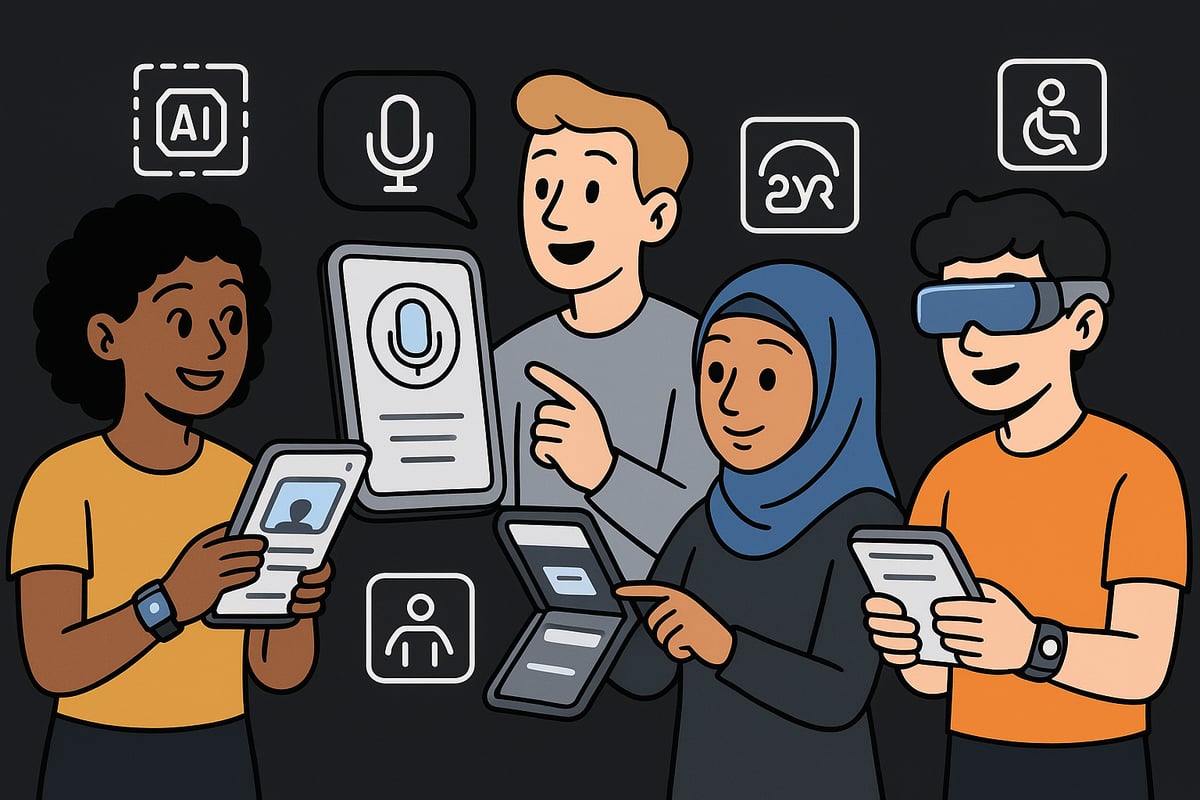
Voice and Gesture-Based Navigation
Voice and gesture controls are revolutionising how people interact with their devices, making design in mobile more accessible and efficient. Voice user interfaces enable hands-free navigation, benefiting users in situations where touch is impractical.
Gesture-based controls are replacing traditional tap and swipe actions, allowing for quicker, more natural interactions. Integration with smart assistants and IoT devices further extends the reach of mobile design.
By embracing these technologies, designers ensure that design in mobile remains inclusive and future-ready, meeting the needs of diverse user groups and evolving device ecosystems.
Minimalist and Content-First Interfaces
Minimalism is a defining principle of design in mobile for 2026. By prioritising essential content and reducing visual clutter, interfaces become more readable and user-friendly.
Large, legible typefaces and strong contrast improve scanning and comprehension. Notion’s clean, content-focused design is a prime example, guiding users effortlessly through complex workflows.
A content-first approach ensures that users quickly find what they need, increasing satisfaction and reducing cognitive load. Designers must balance simplicity with functionality to create exceptional design in mobile.
Accessibility and Inclusive Design as Standard
Accessibility is no longer optional in design in mobile. Compliance with WCAG 2.2 and similar standards is expected, ensuring products are usable for people of all abilities.
Features like dark mode, scalable fonts, and high-contrast options are now standard. Ignoring accessibility not only limits reach but also poses legal and reputational risks for brands.
By embedding accessibility into every stage of the design process, designers create experiences that empower everyone. The future of design in mobile is inclusive, ethical, and universally accessible.
Seamless Cross-Device Experiences
Users expect continuity across their devices, making seamless cross-device experiences a vital trend in design in mobile. Whether on mobile, wearable, or desktop, users want their data and preferences to follow them.
Cloud syncing and persistent user profiles enable this smooth transition. Adobe Creative Cloud’s cross-platform workflow illustrates how integrated experiences boost productivity and satisfaction.
Designers should plan for device diversity, ensuring that design in mobile adapts gracefully to new form factors and usage scenarios. This approach builds loyalty and keeps users engaged.
Sustainability and Ethical Design
Sustainability and ethics are gaining traction in design in mobile. Energy-efficient animations and dark modes help conserve battery life, appealing to eco-conscious consumers.
Transparent data usage, privacy controls, and ethical design practices foster trust and long-term loyalty. Users increasingly choose brands that reflect their values and prioritise responsible design.
By making sustainability and ethics core principles, design in mobile contributes to a better digital future. Embracing these values sets brands apart and drives meaningful impact.
Best Practices for Usability and Accessibility in Mobile Design
Creating exceptional design in mobile requires a deep understanding of both usability and accessibility. As user expectations grow, designers need to ensure every mobile experience is intuitive, inclusive, and enjoyable. The following best practices provide a blueprint for delivering standout results in 2026.
Simplicity and Clarity Above All
The foundation of effective design in mobile is simplicity. Users should be able to navigate and complete core actions without confusion. Focus on removing unnecessary elements and highlight only the most important features. Clarity in copy and iconography ensures users understand every interaction.
- Keep navigation straightforward
- Use clear, concise language
- Limit on-screen elements to essentials
Research shows that simpler interfaces reduce errors and boost retention. When users can find what they need instantly, their satisfaction with design in mobile increases dramatically.
Consistency Across Platforms and Devices
Consistency is vital for building trust and facilitating seamless experiences. Establish a robust design system to unify navigation, colour schemes, and interaction patterns. This ensures users recognise your brand and understand how to interact across devices.
For more on aligning your strategy with current best practices, see Website design and development trends.
- Standardise fonts and colours
- Maintain consistent button styles and feedback cues
- Use shared libraries for efficiency
A unified approach to design in mobile prevents confusion and supports brand recognition, no matter where users engage with your digital products.
Designing for Thumb Zones and Ergonomics
In 2026, understanding how users hold and interact with devices is essential for effective design in mobile. Place primary actions within easy reach of the thumb, catering to both left and right-handed users. Adapt layouts for larger devices and foldables to maintain comfort.
- Place key buttons in natural thumb zones
- Allow for flexible hand positions
- Design layouts that scale for various screen sizes
Studies reveal that 75 percent of users prefer one-handed operation, making ergonomic considerations a non-negotiable aspect of design in mobile.
Feedback and Microinteractions
Immediate feedback helps users understand the results of their actions. Microinteractions, such as subtle animations or colour changes, make design in mobile feel more responsive and engaging. Haptic feedback adds a tactile layer, confirming successful actions or highlighting errors.
- Use colour shifts for confirmations
- Integrate gentle animations for transitions
- Employ haptics for key interactions
By making every action feel acknowledged, you reduce user uncertainty and enhance the perceived performance of your design in mobile.
Prioritising Readability and Visual Hierarchy
Readable content is at the heart of accessible design in mobile. Use large, scalable fonts and ensure sufficient contrast for text and backgrounds. Establish a clear visual hierarchy so users can scan information easily and act quickly.
- Select legible typefaces
- Use bold colours for important elements
- Group related content logically
A well-structured layout not only improves comprehension but also supports users with varying visual abilities, reinforcing the importance of design in mobile.
Accessibility for All Users
Accessibility is now a standard expectation, not an added feature. Ensure your design in mobile supports screen readers, includes alt text for images, and allows keyboard navigation where necessary. Test your solutions with users of different abilities and comply with legal standards, such as the latest EU accessibility laws.
- Add descriptive alt text to visuals
- Enable resizable text and high-contrast modes
- Conduct user testing with individuals with disabilities
Prioritising accessibility widens your reach and demonstrates a commitment to inclusive design in mobile.
Personalisation Without Compromising Privacy
Users value personalisation, but expect transparency and control over their data. Let users adjust notification and content preferences, and offer clear opt-in or opt-out choices. Explain how personal data is used, reinforcing trust in your design in mobile.
- Provide privacy controls within settings
- Allow users to customise their experiences
- Communicate data usage clearly
Balancing personalisation and privacy builds long-term loyalty, ensuring your design in mobile remains both effective and ethical.
Workflow, Tools, and Technologies for Cutting-Edge Mobile Design
Staying ahead in design in mobile requires a strategic blend of the right tools, modern workflows, and a keen eye on emerging technologies. As 2026 approaches, designers and developers must streamline their processes to deliver seamless, innovative, and accessible experiences.
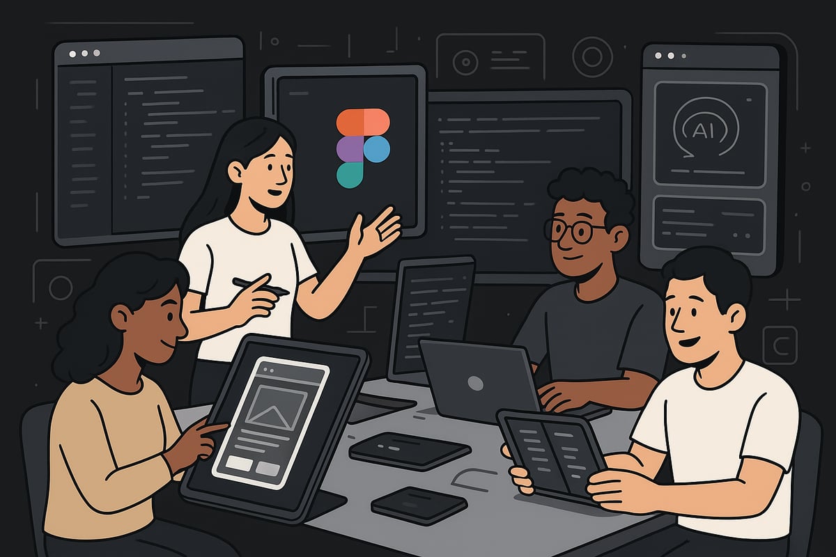
Essential Design and Prototyping Tools
The foundation of any successful design in mobile starts with selecting the right design and prototyping platforms. Figma leads the way for collaborative, cloud-based design, enabling real-time teamwork across locations. Adobe XD and Sketch remain strong choices for interface design, each offering rich libraries and plugins.
Prototyping is crucial for validating ideas early. InVision and Principle allow designers to build interactive prototypes without code, making user testing more effective. These tools support version control and quick iterations, keeping workflows efficient.
Key features to look for:
- Real-time collaboration
- Asset libraries and reusable components
- Easy user testing integration
Choosing the right toolkit ensures your design in mobile is both creative and consistent.
Leveraging AI and Automation in the Design Process
AI-driven innovation is reshaping design in mobile workflows. Modern tools now offer AI-assisted layout suggestions, automatically generating design assets based on content or user data. This accelerates ideation and reduces manual effort.
Automation can also handle repetitive tasks. For example, automated accessibility checks flag issues before development, and some platforms export production-ready code directly from designs. This improves handoff speed and reduces errors.
Benefits of AI and automation:
- Faster prototyping and iteration
- Increased accuracy in accessibility
- Consistent brand visuals
Integrating these technologies allows teams to deliver smarter, more adaptive design in mobile projects.
Cross-Platform Development Frameworks
Delivering consistent design in mobile across devices is easier with cross-platform frameworks. Flutter, React Native, and SwiftUI enable developers to build apps for iOS and Android from a single codebase, streamlining maintenance and updates.
Each framework has its strengths. Flutter provides rich customisation and smooth animations, React Native offers strong community support, and SwiftUI integrates deeply with Apple's ecosystem. Choosing between native and hybrid approaches depends on performance needs, budget, and project goals.
Comparison Table:
| Framework | Strengths | Ideal Use Case |
|---|---|---|
| Flutter | Custom UI, fast iteration | High-fidelity apps |
| React Native | Community, web integration | Startups, MVPs |
| SwiftUI | Apple-first, native feel | iOS-only applications |
Selecting the right framework ensures your design in mobile remains scalable and future-proof.
Integrating User Testing and Analytics
Effective design in mobile is built on data-driven insights. Continuous usability testing with real users identifies friction points and validates design choices. Tools like heatmaps and session recordings reveal how users interact with your app, guiding improvements.
A/B testing different layouts or features provides measurable feedback, helping teams refine user experience iteratively. Analytics platforms track engagement, retention, and conversion rates, offering a clear picture of what works.
Best practices:
- Test early and often
- Use diverse user groups
- Analyse both quantitative and qualitative data
By embedding testing and analytics into the workflow, design in mobile becomes more user-centric and impactful.
Collaboration and Handoff Between Design and Development
Smooth collaboration is essential for delivering outstanding design in mobile. Design systems and shared component libraries ensure consistency across teams and platforms. Tools like Zeplin and Figma’s Dev Mode streamline the handoff, providing developers with clear specs, assets, and code snippets.
Key collaboration tips:
- Maintain detailed documentation
- Schedule regular design-development reviews
- Use shared libraries for faster updates
Reducing friction during handoff minimises rework and accelerates the delivery of high-quality design in mobile products.
Staying Up to Date with Emerging Tech
The pace of change in design in mobile is relentless. Staying current means monitoring updates in iOS, Android, and web standards. Experimentation with AR, VR, and spatial computing is increasingly important as these technologies become mainstream.
Professional communities, online courses, and industry blogs help teams keep their skills sharp. For a deeper dive into the trends shaping the next generation of mobile experiences, explore Mobile App Development Trends 2026.
Embracing new technologies ensures your design in mobile remains relevant, accessible, and innovative.
Actionable Tips for Designing Mobile Experiences That Stand Out
Creating standout design in mobile requires a methodical, user-centred approach. As expectations climb in 2026, following a clear process will help you deliver mobile experiences that are intuitive, inclusive, and future-ready.
Step 1: Start with User Research and Empathy Mapping
Begin every design in mobile project with a deep understanding of your audience. Conduct interviews, observe user behaviour, and create detailed personas that capture motivations, frustrations, and contexts.
- Map out user journeys to identify pain points.
- Use empathy maps to visualise user emotions and goals.
- Prioritise user needs before jumping into visual design.
This foundation ensures your design in mobile aligns with real-world expectations and lays the groundwork for meaningful solutions.
Step 2: Prioritise Content and Core Actions
Effective design in mobile puts essential information and tasks front and centre. Identify the primary actions users want to take and structure your interface to minimise distractions.
- Use wireframes to establish a clear content hierarchy.
- Remove or defer non-critical elements.
- Highlight core actions with distinct buttons or gestures.
For e-commerce, E-commerce mobile design solutions can inspire layouts that boost conversions and streamline mobile shopping experiences.
Step 3: Prototype and Test Early, Test Often
Rapid prototyping is vital for successful design in mobile. Build interactive prototypes to gather feedback quickly and iterate based on real user insights.
- Test with diverse user groups, including those with disabilities.
- Use A/B testing to compare design alternatives.
- Incorporate analytics to track engagement and identify friction points.
Explore data-backed patterns in Mobile UX/UI Design Patterns 2026 for inspiration and guidance on emerging best practices.
Step 4: Optimise for Speed and Performance
Performance remains a pillar of design in mobile. Users expect instant responses and smooth interactions—any delay can lead to frustration and abandonment.
- Compress images and use efficient file formats.
- Minimise code and leverage lazy loading for content.
- Continuously monitor load times across various network conditions.
A fast, responsive app is more likely to retain users and outperform the competition.
Step 5: Make Accessibility a Non-Negotiable
Accessibility is not just a compliance checkbox, it is a core requirement for modern design in mobile. Integrate accessibility standards from the outset to ensure everyone can use your product.
- Provide alt text for images and support screen readers.
- Ensure high contrast and scalable fonts.
- Test with real users using assistive technologies.
Accessible design in mobile broadens your audience and enhances your brand reputation.
Step 6: Embrace Personalisation—But Let Users Control It
Personalisation powered by AI is a hallmark of advanced design in mobile, but control must remain with the user. Allow users to tailor their experience without compromising privacy.
- Offer clear opt-in and opt-out settings for recommendations.
- Let users customise notifications and interface themes.
- Be transparent about how data is used and stored.
Balancing personalisation and privacy builds trust and long-term engagement in your design in mobile.
Step 7: Stay Consistent, Yet Adapt to New Devices
Consistency is key to a seamless user journey, but flexibility is just as important as new devices emerge. Use a robust design system to maintain visual and functional harmony across platforms.
- Adapt layouts for foldables, wearables, and new screen sizes.
- Maintain consistent navigation and branding.
- Anticipate future trends by monitoring industry updates.
By staying agile, your design in mobile will remain relevant as technology evolves.
Real-World Examples and Case Studies: Mobile Design Excellence in Action
The landscape of design in mobile is shaped by real-world leaders who set the benchmark for usability, accessibility, and innovation. By exploring these standout examples, you can discover what truly drives success and learn how to apply these principles to your own projects.
Citymapper: Intuitive Urban Navigation
Citymapper sets a high standard for design in mobile by focusing on real-time data, vibrant colour coding, and seamless integration of multimodal transport. The app’s interface is optimised for clarity, with bright icons and bold route highlights that help users make quick decisions. Accessibility is a core feature, offering voice guidance and clear feedback to support different needs.
- Real-time transport updates
- Multimodal journey planning
- Accessibility-first features
These elements build user trust and loyalty, demonstrating how thoughtful design in mobile can transform daily commutes.
Notion: Productivity and Content-First Design
Notion exemplifies content-first thinking and minimalist design in mobile. Its clean interface removes distractions, making it easy for users to focus on their notes, tasks, or databases. The app’s responsive layouts ensure a seamless experience across smartphones and tablets, always prioritising readability.
- Customisable workspace
- Large, readable typefaces
- Effortless cross-device sync
By keeping content at the centre, Notion shows how design in mobile can boost productivity and support diverse workflows for both individuals and teams.
Spotify: Personalisation and Microinteractions
Spotify redefines design in mobile by using AI-driven personalisation and engaging microinteractions. The app adapts playlists and recommendations to individual tastes, while subtle animations and haptic feedback enhance every tap. This dynamic approach ensures users always feel connected and in control.
- Algorithmic playlists tailored to users
- Animated transitions, responsive buttons
- Customisable notifications
Spotify’s mastery of design in mobile reflects Mobile-First Design Trends 2026, showing how personalisation and feedback can set a product apart.
Adobe Express: Mobile-First Content Creation
Adobe Express champions mobile-first design in mobile, offering templates and creative tools built specifically for smaller screens. Accessibility and SEO are woven into the workflow, making it easy for anyone to create standout content on the go. The app supports image editing, video creation, and social sharing, all optimised for mobile performance.
- Pre-built templates for quick content
- SEO and accessibility checks
- Fast, intuitive navigation
With 55 percent of online sales now coming from mobile, Adobe Express proves that investing in design in mobile pays measurable dividends for brands and creators.
Common Pitfalls and How Top Apps Avoid Them
Even leaders in design in mobile can stumble if user needs are overlooked. Common issues include cluttered interfaces, slow load times, and inconsistent navigation. Accessibility failures can also limit reach and risk non-compliance.
- Overcrowded screens
- Inconsistent icons and navigation
- Neglecting accessibility standards
Top apps continuously test and refine their design in mobile, using analytics and feedback to avoid these traps and ensure long-term growth.
Measurable Impact of Great Mobile Design
Effective design in mobile delivers tangible business results. Brands that invest in accessibility and seamless UX see higher engagement, retention, and conversions. Improved readability and intuitive layouts broaden audience reach and foster loyalty.
| Metric | Impact of Great Design in Mobile |
|---|---|
| Engagement | Increased session length |
| Retention | Higher repeat visits |
| Conversion | Boosted sales and sign-ups |
| Accessibility | Expanded user base |
| Brand Loyalty | Positive reviews, referrals |
By prioritising design in mobile, organisations stay ahead of the curve and secure lasting advantages in an ever-evolving digital market.